
So yesterday I explained a little about what Photoshop layers are, and how they work. You basically use them to keep parts of the picture separate so you can move them around and make them bigger and smaller and change things about them without affecting the rest of the image.
In that post I played with a photo, but layers are especially useful when you are drawing pictures.
I think the best example would be if you look at the concept drawing here of my Misplaced Hero cover: There's a scene in the middle, and a nice neat, square frame around the outside. When I paint that image in the middle, I want to use free brush strokes. I want to paint beyond the edges of that frame. So if the frame is on another layer, it's like it's a real frame in real life -- a separate piece. The frame is safe from paint, and the paint is safe from the frame if I want to change sizes.
So now I want to transform this concept sketch into a Photoshop file, the first step is to really look at it, and see how the pieces interact, and then plan out how I will set up my layers. I would do this if I were using clip art too.
And just as there are "pantsers" and "plotters" at writing, some people plan layers like I do, and others just add layers as they work. However, I find thinking about it first really helps make the process go smoother. There's nothing worse than painting two things on the same layer and then later realizing you wanted to separate them. It isn't just a matter of copy and paste -- as I showed you in yesterday's post, it will leave a hole, and there are ragged edges. It's a mess.
 First I scan or take a photo of my original pencil sketch, and I make that the background layer of the image.
I'll want to keep that layer locked most of the time, so that I don't accidentally mess it up. In this case, I had to unlock it, because there is too much space at the bottom, and not enough at the top for the title. So I'll unlock it, position it the way I want it, then re-lock it.
(Photoshop users, this is a good thing to do anyway -- because Photoshop has a weird feature that it lets you draw on the the locked background layer. You can't move it, but you can draw on it! However if you unlock it, it stops being a background layer. You can then re-lock it, it actually LOCKS the layer so you can't draw on it. Weird but true.)
At this point you'll also want to decide the size of your image. With an ebook, it doesn't matter so much. It just needs to be approximate book proportion and a high enough resolution that Amazon and Smashwords will accept it. If I know for sure it will NEVER be a paper book, I usually make it 600 pixels wide, by 900 pixels tall. If you're going to do a paper book, you really have to know your exact dimension, plus bleed, and resolution and do the math. I'm not going to do that here, but I'll explain it later if anybody wants me to.
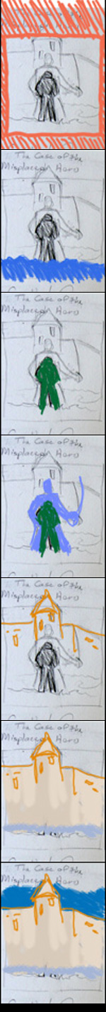 Let's look at the parts of this design, shall we? Which things are in front and which are in back? Which belong together, and which are better separated? NOTE: We're going to ignore the fonts for now -- because fonts have separate layers anyway. (We'll talk about those next week.) So look at the sketch:
The top layer is the frame... or wait, is it the roof of the castle? Uh, oh, my design calls for something tricky here. The castle walls are behind the frame, but the roof "breaks out" of the frame, and appears in front. ( I have to admit, I have a weakness for breakouts. They're a spiffy cool design thing -- and part of the point is that the breakout feels dynamic. It's like it's alive.)
There are several ways to deal with this, but they can all be done later, so I'm going to worry about those in a later post. For right now, we're going to pretend there isn't a break out. The frame is on top, the castle is in the background. I created the layer and sketched it out in orange so you could see it. (Then I turned it off so it wouldn't be in the way.)
What's next? The water. Alex is standing in water -- because he rises out of water into the world of Awarshawa, so a few of the waves appear in front of him. That's on its own layer so I can paint outside the lines all I want, and also play with position and color. I may want Alex in deeper or not so deep. The water is in blue in the second panel.
Then comes the solitary figure of Alex, as an alienated modern college student. He's in green because he's an MSU student. (Go Green!)
Then comes the larger Alex - The Hero Swashbuckler In His Soul. The Swashbuckler is in lavender because he's manly enough to deal with it.
Now, with these two figures, I'm going to have a challenge drawing them. They're going to be silhouettes, and they're not going to be real detailed, and they're going to have to be clear what they are even at a small size. I mean, look at my pencil sketch: it's not fully clear whether that line is the corner of the castle or the Swashbuckler's sword.
So layers are really going to help me out there. I can reposition either of them, resize them, and even re-draw one without disturbing the other. I can change the Swashbuckler from a sword-up-and-ready position to a sassy sword-down position if it works better. All without disturbing the rest of the image.
Up to this point it's obvious that all these elements should be on separate layers.
But the background layer is trickier. It could be just a painting of a castle -- one layer. But let's pause to think about how you paint a scene like that: A real painter would first paint in that texture and color in large rough brush strokes, and then paint in the details on top of that, like the windows and the line of the edges later.
However, since those details are all on top of the background texture and color, I could put them on a separate layer. And then I could change my mind after I saw all the details in place. I could repaint the background, change it from warm limestone to cold granite, or I could make it awash in moonlight or even a bright sunny day. And the details would not be disturbed. I could preserve the details like the windows and the lines, and just change the background. Same with if my hand slipped when I was drawing the line and I made a mistake. If they were on the same layer, I'd have to erase part of the background when I erased the mistake.
So I created two layers for my castle. And I'm thinking I want another for the sky. The sky seems so simple, but that just gives me one more reason to put it on a layer by itself. I can just fill the whole layer with dark blue. I can brighten or darken it separately from the castle, and move the castle around more easily. I can put little men on the castle walls and then change my mind and erase them. (I can put a giant cat back there...) I can add clouds or take them away more easily.
So in the end I'll have nine layers, from the top down:
1. Fonts
2. Frame
3. Water
4. Small Alex
5. Swashbuckler
6. Castle details
7. Castle color
8. Sky
9. My original sketch
Is that a lot of work? No, actually it isn't.
It's a lot of thinking. It saves work. Your best bet is to first be creative and sketch ideas. But once that's done, you should pause for a moment and be logical and plan what you're doing. Then you can start being creative again.
Now, as I said, next time, I will talk about fonts. Because this is a book cover, and I will want to be sure my Title and Author Name are highly visible even at the thumbnail size. I may have to adjust a few things if they aren't.
See you in the funny papers!
2 comments:
Many thanks again, Camille. Another great explanation . . . as usual!
Thanks.
I have had a sudden drop in traffic on the blog today, and it's nice to know somebody's reading....
Post a Comment