But since I get a lot of questions about how layers work, I though I'd give you a brief introduction to the concept. (Especially since many writers doing their own covers could use a little more information about them.)
I did this in Photoshop, but many other graphics applications also have layer capabilities. If you see something you want to do here, you may want to look up tutorials online for your favorite software. Some of you may want to get a copy of Photoshop Elements -- which is a pared down version of Photoshop and cheaper. However, I don't know which features are missing, so I don't guarantee you can do everything I talk about in Elements.
First a little theory: What are layers?
Layers are a way of separating parts of the picture so you can work on them separately. In Photoshop, it's like you've got parts of the picture on clear plastic sheets, all piled on top of each other. You can change the order of the sheets to put some items in front or behind the others, or move each part around, independently of the others.
It works a little like old time cel animation. And since I was an animator during my first couple of years of college, layer have always made complete sense to me. (Here is a YouTube video about the history of cel animation.)
When you open a Photoshop document, it starts out with one layer. It's like a piece of paper. It might have a photograph on it, or you might draw things on it and erase things from it. But just like when you are drawing on paper, when you draw something over the top of something else, you basically destroyed the thing under it.
The Example of Max and Rushmore
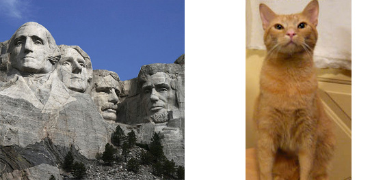
My cat Max is very jealous of my trip down east last week, and he wants his own travel pictures to show off. He wants a picture of himself visiting Mount Rushmore.
Here is Mount Rushmore, and here is Max.

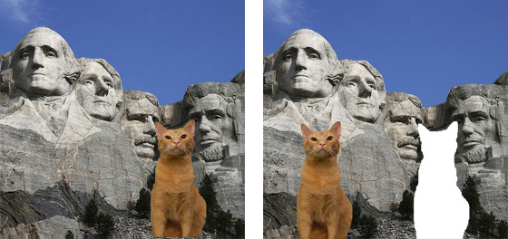
I cut Max out of the background of his own picture and plopped him down in the Mount Rushmore picture. If I only had one layer to work with, then I would position his picture just right, but once I actually put the cat down on the mountain, that position becomes permanent. His picture replaces what's behind it.
So if Max decided he didn't like the way his ears seemed to poke into the presidents' eyes, I'd have to cut his picture out to move it. And that would leave a hole. As you see below.

To avoid that problem, I put his picture on a different layer in the image. Now where ever I move him, the there is no hole in Mount Rushmore.
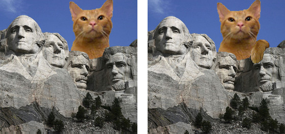
Ah, but Max has decided that if presidents can be colossal, so can cats. He wants to be as big as the presidents and to tower over them. Since I have him on a separate layer, I can easily use the "Transform" command to make him bigger. But if he wants to be behind Mount Rushmore, towering over it, I've got another problem. His layer is either in front of, or behind, the Rushmore layer. If he's behind it, the sky will cover him up.
I could fake it by leaving him in front, and erase part of him so that the mountain shows. Except that, once again, if I wanted to move him a little, there would be a hole in the cat, and it would show.
The solution here is to add another layer -- this time I'll cut the sky and the mountain apart, and put them each on separate layers. Giant Max goes between the sky and the mountain. Perfect!

But wait, there's more!
Max has decided he wants it to look like he and Abe Lincoln are buds. And what is a better sign of affection than draping your paw over somebody's face? Which, of course, would be in front of the mountain layer. Which is easy enough -- I just put the paw on a separate layer in front.
Ah, but the only picture I have of his paw was taken at a different time, and it's kind of fuzzy and grayed out. It doesn't even look like it belongs to the same cat. I can adjust the color saturation and sharpness to match, though. And since it's on its own layer, I don't have to worry about messing up the rest of the picture while fiddling with it.... which, of course, is one more advantage of layers. You can adjust the brightness and contrast and such separately from the rest of the picture, as well as run fancy filters on them.
And that's just the most basic stuff you can do with layers. You can also do all sorts of special effects. For instance...
If you look at the books "Harsh Climate" and "The Adventure of Anna the Great," the last two book covers in my sidebar, you'll see two examples of a special kind of layer called a "blending layer." In both cases, the picture is black and white. Just above the picture is a separate layer filled with solid blue, on which I've set the blending options to "multiply" which blends the two layers in terms of color. I can change the color by simply filling that layer with a different color.
And that brings me to the greatest Stupid Layers Trick: one very cool thing you can do with layers is turn them off!
You can have layers with several different options, and just turn them off and on to look at what you want to. This is great when you're painting a picture and you want to work on just the background. You can just turn off the foreground, which blocks your view.
Another reason you might turn them on and off is when you want to try out different options. For instance, for the cover of Anna the Great, I actually have four or five "blending layers" in the original document, each with a different color. I can quick turn off blue and turn on red to see if I like that better.
It's also very useful when you are producing something with variations on the same image. Like, well, like this Max and Rushmore tutorial. All those images -- small Max, big Max, the paw, the sky, Rushmore itself, and the hole in Rushmore -- are on several layers in one single picture. To make the various images above, I just turned some on and some off for each example. Easy peasy.
There is a lot more you can do with layers, and I am unashamed to say that I myself barely scratch the surface of what you can do. For instance, I've never played with something called a layer mask. However, that is something I'll probably use on the Misplaced Hero cover, because the design has a special effect we call a "break out." That's where part of the background appears to "break out" and be in front of something in the foreground.
But I will talk more about that later when I get to that part of the design. For tomorrow, I'll just explain how I use layers to break down and plan out my design.
(BTW, for those who need a little more direct "how to" information -- here is a YouTube tutorial about the most basic layers concepts.)
Continue with the covers series with "Using Layers to Plan the Cover."
See you in the funny papers.

4 comments:
Thank you so much, Camille. Your layers explanation was most helpful, although I'm still not precisely sure how to use it.
How does it all work with art rather than actual photography? I'm assuming that at least some of your covers are using artwork on some of the layers. And, while we're at it, who does your artwork?
I do my artwork. This Tuesday series is all about doing a cover from scratch, from planning through drawing through learning new skills.
This post is kind of background information so you'll understand Tuesday's post better. There I'll get into the nitty gritty on how I use it for artwork.
I will still not be doing a direct "how to" in that I won't be saying "Select 'New Layer' under the layers palette menu..." or anything like that. It's hard to do that without extensive illustrations and text -- and my point is about decision making and the art itself.
However, videos are great at some of that, so I will see if I can find more tutorials on YouTube which illustrate the actual steps.
Here's one that covers the basics on what I wrote in this post:
http://www.youtube.com/watch?v=F4EooYoYYTQ
Oh, and just to be clear, the ARTWORK on my covers is my own. I do sometimes buy stock photos for use in the covers -- for instance, the cover for Harsh Climate came from Fotalia.
Thank you, Camille. Looking forward to your next blog on the subject.
Post a Comment