However, I can't sketch on a computer. Even with a Wacom tablet, I have proportion problems. For most people that issue goes away as they get used to the tablet, but I honestly think I have an image processing issue in my brain. Or it could just be a visual tracking problem. (I can't tell right from left to save my life, AND I can't watch 3-D movies for more than about a half hour at a time, because my right eye is not used to doing equal work with the left.) When you work with a digital tablet, you draw in one place while looking in another. The proportions change as you zoom in and out, and if you shift the tablet to tilt a tiny bit in one direction or other, your brain has to reprocess and readjust the direction you imagine the lines are going.
So while I can edit and polish and do all sorts of spiffy things on the computer, I can't sketch. There are too many constant adjustments for my poor silly brain to deal with. Sure I always improve with practice, which is one reason I will be spending the summer learning more about Corel Painter. (This is one thing I never mastered on paper anyway -- painting. I do pencil. I love pencil. But for painting, I'd rather use a computer because of that cool factor of being able to paint in all sorts of media at once.)
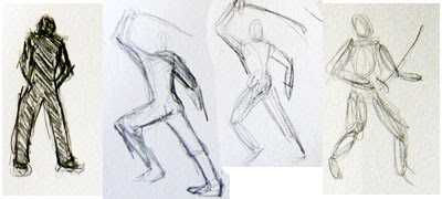
When it comes to drawing people, especially people for exciting adventure covers, there is one kind of sketching which is critical to getting started. And I finally realized that was the step which was missing when I was trying to work on the computer: it's called the gesture drawing. You do quick shape sketches which get the proportions right, and also give you that lively feel of movement.
You can't get that in tracing or replicating a photograph. A photograph is about the surface detail. A gesture drawing is about the bones and muscle.
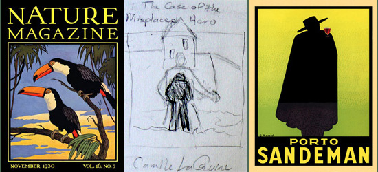
Further below, you'll see the gesture drawings I did on the day I was driving past Staples and realized I needed something to sketch on -- and I stopped in and bought a bunch of 8 x 5 cards. That allowed me to sketch up elements to fill that square in the middle of my design. If you remember from last week's post, I decided on a design with a frame around and illustration -- here are the period covers I am using as inspiration for layout with my new cover sketch in the middle.

I had a lot of ideas that day, but knew the foundation of the image would be the figure of the lonely college student. It isn't a detailed image (and probably won't be) but it evokes a modern sense of alienation. Like a problem novel of the sixties.
From there, I had several ideas about what surrounds him. I could just have that figure on a gradation background like the Sandeman ad, but I also want to evoke the heroic aspect -- so should have shadowy adventures going on in the background? Alex standing in water, and before him a fortress, and a figure climbing the walls or fighting bad guys or...?
Once I started sketching the action poses, I realized that a ghostly image of a larger swashbuckling hero which stands around and above Alex just might be the right image.

Things which you sketch don't always translate well into a finished work. Details you imagine will stand out, end up disappearing when you polish it, etc. But I think I have a concept to work with.
This is a LOT of work for a 99 cent novelette. That's why I'm thinking of designing this as the "anthology" version. I will probably use it for each of the novelettes which make up the collection, but I might shrink the image and add a large "BOOK 1" to the cover or do something to differentiate each part. The other thing I could do is to get the human figures right, and then just change the setting in each one.
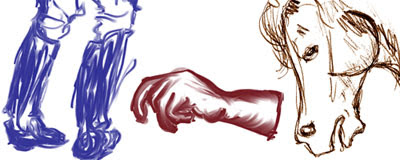
Update: since I first wrote this post, I have had the chance to do more sketching, and I also have acquired my own copy of Corel Painter. I have gotten a lot better at sketching on computer, and I'll talk more about this later when we get into the illustration phase. (See the samples at the bottom of the post.)
However, next week we're going to talk about Photoshop and one of the more technical aspects of breaking down my preliminary sketch so I can plan out how I want to create the various parts and put them together. It's kind of like outlining, only I use Photoshop "layers" to sort out the pieces. (But first a side note about Photoshop Layers for those who might want a little more orientation.)

See you in the funny papers.

2 comments:
I'll be looking forward to the Photoshop layers explanation. Never have figured that out, or how to combine layers.
I never had a problem understanding layers because I was an animator my first two years of college. Photoshop layers are basically just like cel animation - layers of acetate piled on top of one another. (Only it's MAGIC acetate!)
I do know that a lot of people have problems understanding layers in Photoshop, though. Maybe I'll do an extra post Monday, about how you put together a simpler cover with layers (like maybe Harsh Climate or Anna the Great), and then get to my plans for Misplaced Hero on Tuesday as usual...
Post a Comment