(For new readers, this is a continuation of my series about creating a cover. Most of this post is a "standalone" but you may want to catch up with my first post in the series, about using Amateur Illustration as a Brand.)
I now have eight books, each with a completely different style of cover. And I have two more coming which will have completely different styles yet. And the genres of the books are also all over the place. So much for branding....
And yet a part of this is the learning curve. The books have somthing in common: my voice. And what I'm doing now is finding my visual voice. And this week I think I've found it, at least for my most "off-genre" books.
The Wife of Freedom is my toughest book to put a cover to. It's all genres and no-genres. When I sat down to write it, I deliberately threw off the idea of publication. I knew I wanted to write something without world-building or historical detail. I wanted to write a pure
story. It's like a play on a stage -- with good costumes and props, but if the actors don't touch it, it either isn't there, or it's a dim painted backdrop which suggests more than it shows.
I wanted to do this partly as a reaction against the fashion of the time, in which setting overwhelmed everything in a story. In fantasy and science fiction, it was all elaborate world-building and magic systems, in historical fiction it was all time period and setting. Not that I'm against these things. It's just that it got to be the
Monty Python spam sketch. Publishers needed books to be longer and bigger, and were demanding more
stuff in every kind of story. And everywhere you went, everybody was pushing it, workshops talking about how important it was to include more "spam" in every dish. Writers pushing each other to find ways to slip more in. It was almost like an loyalty oath or something. Those who didn't like it, were lectured on being lazy or unsophisticated. I began to feel like I was in a cult.
But there was another reason I wanted to cut the story free of those kinds of expectations, and that was what was really on my mind: I really like folklore and traditional storytelling. Fairy tales don't take place in a specific kingdom. They have no historical accuracy or even consistency. They're like dreams -- they use what's useful and throw the rest away. And I wanted to capture that but in a regular story.
And it still might have been okay if I had written it as a fantasy, but I didn't have a story to tell about magic. I had a story about people.
Ah, but how to explain to anyone just what the heck it is? It's not a fantasy (though it takes place in an unreal world), it's not an historical (though it is
like an historical), it's a love story which is decidedly not a romance.
And given all of the above (especially since I wrote it to be NOT publishable), it was the obvious choice to self-publish when I first heard about Kindle publishing.
Except, your first book is your "learning experience" book. Yikes! Blurb and cover are a real challenge for that book! I first did the obvious with a classic painting (public domain). Then I tried going for symbolism with a coin-like image. (After all part of Mary's problem is that she is seen by others as a symbol more than as who she is.) But the art really didn't convey the concept, and it just looked ugly.
But heck, it's not a book which sells much anyway. Maybe once every two months. No Big. Just forget about it.
The along comes this series of blog posts:
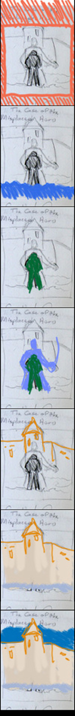
The Misplaced Hero cover and all my efforts to come up with a brand for it. So there I am, studying period samples, and WPA posters and sitting in on these lectures in the Digital Illustration by a wonderful illustrator.... and things start clicking. And last week, the big click happened.
I had just posted
last week's post about WPA posters, and that very next day, the lectures were on color. And we were looking at examples of connotations and denotations of color, and color schemes and the various kinds of contrast and balance -- like contrast of hue, or contrast of value or contrast of saturation.
And one of the examples was a logo with a child sitting in a tree. It was a stylized silhouette, and the foreground and background were just two different values of the same or similar hue.
"Oh," says I. "Oh! Wait...OH!"
I had this flash of the "Save Your Eyes" poster from
last week's WPA post. That background bit with the workers in silhouette in a darker yellow-orange, separated from the paler yellow background only by hue.
And suddenly I had this experience like on the TV show, CHUCK, where the intersect kicks in and all those relevant images just go flashing through Chuck's head and he suddenly knows what he needs to know. (And he always comes out of the flash saying, "Oh. Oh! OH!" like an eager monkey.)
Flash. My main character, Mary Alwyn is like that child in a tree.
Flash. The whole story is designed to be like a play -- like the plays the WPA sponsored.
Flash. Her husband is a writer of political tracts.
Flash. Politics, woodcuts. The WPA is the wrong period, except (
biggest flash) it can't be the wrong period, because there
is no period. If anything this story is supposed to be like one period filtered through the eyes of many other generations. COOL!
But the intersect kept working for me, because after I got this designed, I began to worry. Is it too much like where I'm going with
The Misplaced Hero and other Awarshi stories? They're really going to look similar compared to the different style of the Mick and Casey covers, and my mystery covers. What can I do to separate them?
And that's when the final thing hit me.
They may not be the same series, but they sure are the same genre. Yes, the Awarshi stories are more swashbuckling and Mary's stories are more melodrama -- but both come from the same well. They both come from an imaginary dream place which is not magical or fantasy, but not realistic. Built of old-fashioned genres and remembered images rather than facts.
Of
course I should brand them the same way. My other books -- the mysteries, and a fantasy I have coming out this fall, have at least one foot planted in a commercial genre, so they should have covers which at least suggest those genres. Mary Alwyn and the Misplaced Hero are their own genre -- and it's good that they feed off each other.
A while ago I posted about being
a newbie and a neo-pro, and how you gain perspective as you go. This goes for covers and branding too. You have a single book, and you worry about presenting that book. You have a second book, and you realize that you should have planned ahead, because that first cover was tough, and matching it will be even tougher. And as you get more books, you begin to think beyond that, and see how your worries didn't matter. And maybe you see something you overlooked in part of your overall brand.
So in that neo-pro post, I quoted Dean Wesley Smith stating that he wasn't accepted as a "real" pro until he had ten published books, and he didn't understand why until he'd written ten more. This is like that. You can't see the whole picture until you get enough pieces.
When you've got a lifetime of all different sorts of things scattered all over your career like I do, it's really nice to see those pieces start to fall into place. It takes time, and you begin to think that big picture is kind of a myth, a holy grail. Something you'll never really
see.
It's lovely when you actually start to see it.
As I said in the last post, I'll be taking a break from posting for a couple of weeks. I'll just post Write-a-thon updates and jokes every Tuesday and Friday. I may post some art if I have something new, though I won't talk about it until August.
See you in the funny papers!
Oh, and you can check out
The Wife of Freedom and its new cover at
Amazon's Kindle Store, or at
Amazon UK, or in multiple formats at
Smashwords. (It is also available from
Barnes and Noble, Kobo and the Sony Bookstores, but the cover hasn't filtered through yet.)